· Data Visualization · 1 min read
Covid dashboard
How the pandemic spread through the Netherlands. Click for pretty animations!
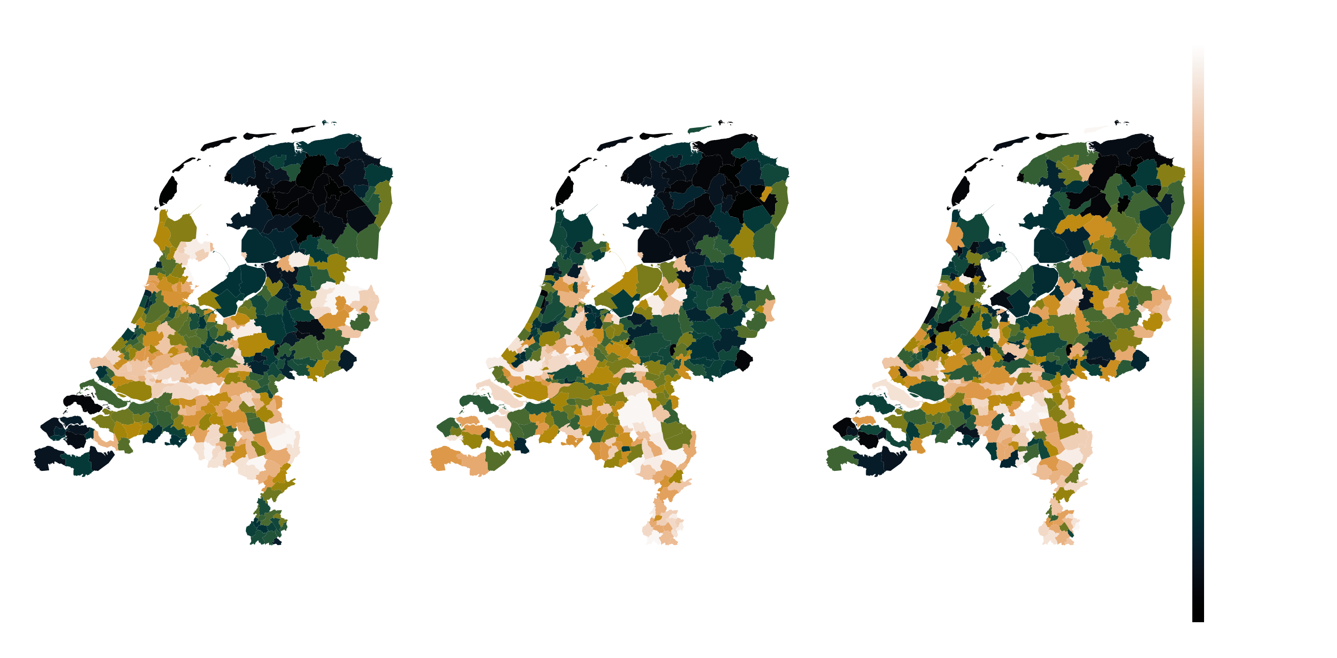
Covid “dashboard” I made over the winter. Data is sourced from the Dutch national corona dashboard.
In order to reflect the spatio-temporal effects of corona, the data consists of three categories per municipality. Namely, it consists of total cases, number of people hospitalized, and the total number of deceased due to corona at per publication date. I designed a metric which I dubbed “relative severity” which had the goal to:
- Reflect the relative contribution to the source vectors at each time point;
- Include a memory effect of the contribution over time;
- Take into account the number of people living in that municipality.
For municipality
were